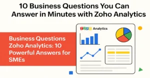
- 1 Introduction: Why Visualization Matters in Zoho Analytics
- 2 Part 1: Comparison Charts in Zoho Analytics
- 3 Part 2: Trend Charts in Zoho Analytics
- 4 Part 3: Relationship Charts in Zoho Analytics
- 5 Part 4: Proportion Charts in Zoho Analytics
- 6 Part 5: Process & Performance Charts
- 7 Part 6: Advanced & Combo Charts
- 8 Part 7: Zoho Analytics Best Practices
- 9 Conclusion: From Data to Decisions
- 10 Frequently Asked Questions (FAQ) – Zoho Analytics Charts
Introduction: Why Visualization Matters in Zoho Analytics
Every modern business runs on data—but data without context is just numbers. That’s why Zoho Analytics chart types are so powerful. With the right visualization, you can spot patterns, track performance, and make faster decisions.
Think about it: would you rather read a 30-page Excel report or see a single dashboard where Zoho Analytics graphs explained trends instantly? The answer is obvious.
But here’s the challenge: Zoho Analytics offers 30+ chart types. From bar charts to heat maps to KPIs, each has a purpose. Choosing the wrong one can confuse your audience. Choosing the right one can drive clarity and impact.
This Zoho Analytics visualization guide will give you a step-by-step understanding of the types of charts in Zoho Analytics—with practical use cases, real examples, and Zoho Analytics best visualization practices.
By the end, you’ll not only know how to use Zoho Analytics charts—you’ll also know which chart tells your story best, whether you’re building marketing dashboards in Zoho Analytics, designing finance charts in Zoho Analytics, or creating HR analytics charts Zoho Analytics for employee performance.
Learn More : Building Dashboards
Part 1: Comparison Charts in Zoho Analytics
Comparison is one of the most common use cases. Whether it’s sales by product, region, or department, these charts help you instantly see winners and laggards.
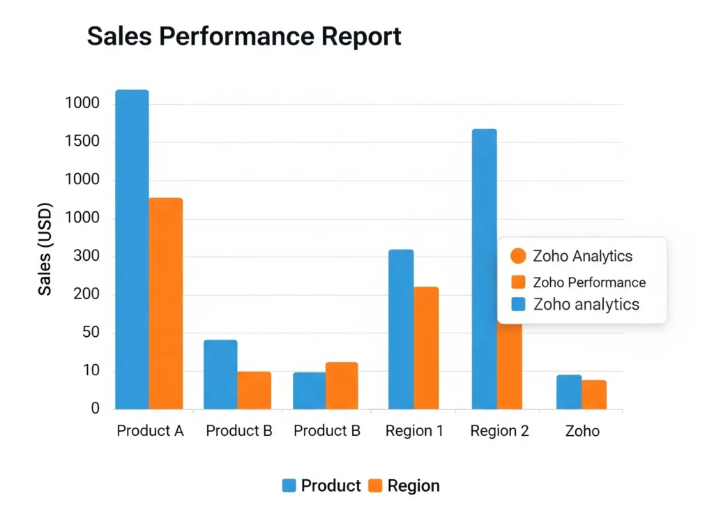
1. Bar Chart
- Purpose: Compare across categories.
- Example: A retailer wants to see sales by region. The bar chart instantly shows North outperforming East.
- Best For: Sales reports in Zoho Analytics where product or region performance needs comparison.
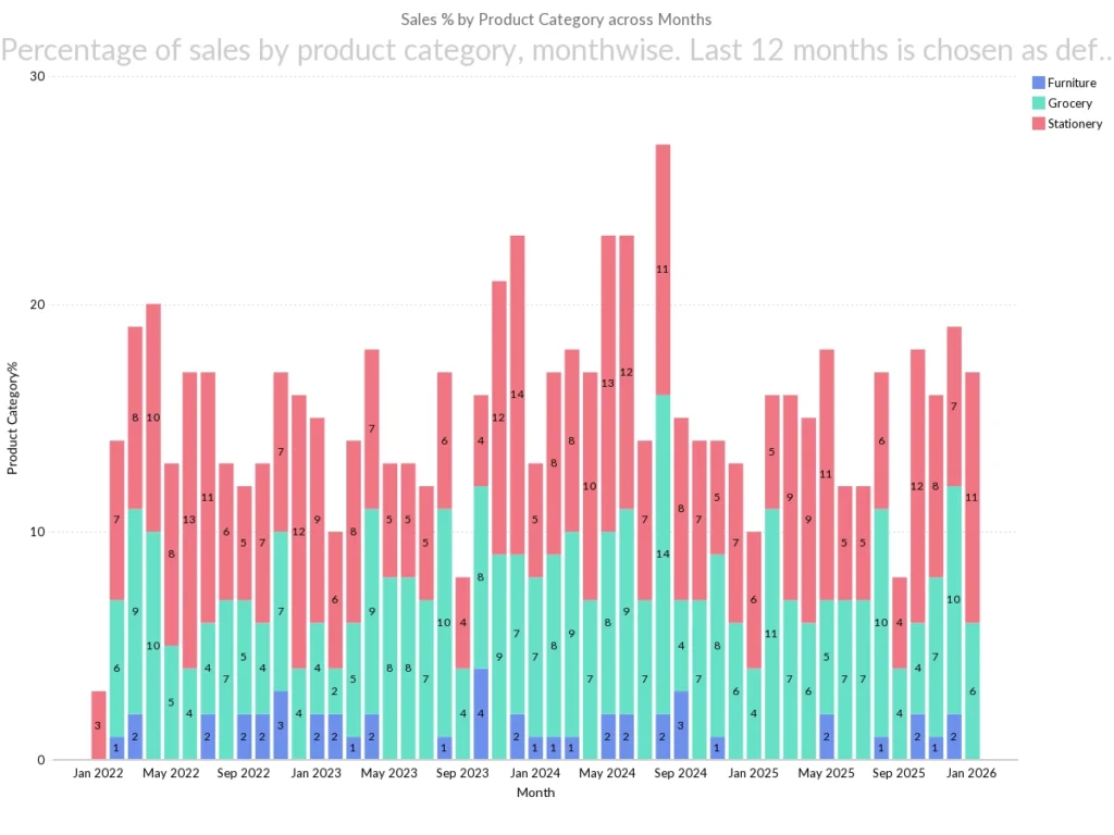
2. Stacked Bar Chart
- Purpose: Show how components contribute to a whole.
- Example: Sales by region stacked by product categories. Now you not only see month wise sales but also which products dominate.
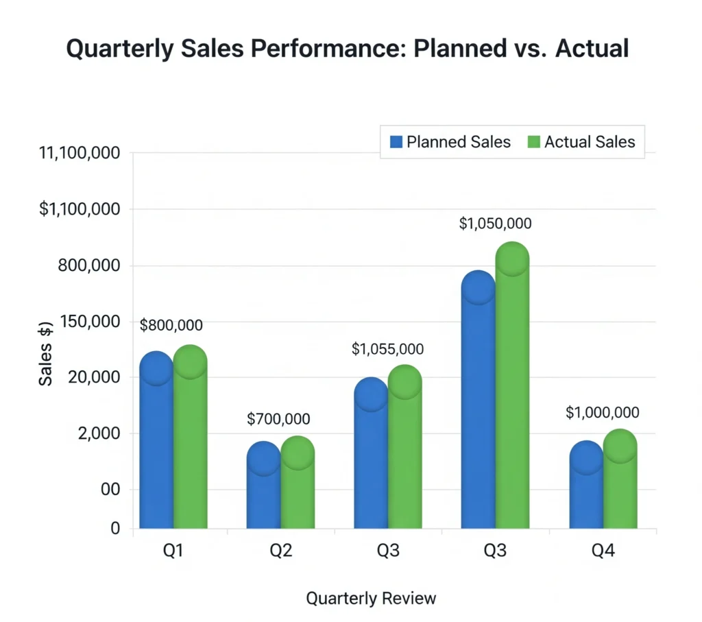
3. Grouped Bar Chart
- Purpose: Compare sub-categories side by side.
- Example: Comparing planned vs. actual sales in quarterly reviews. A grouped bar chart quickly reveals gaps.
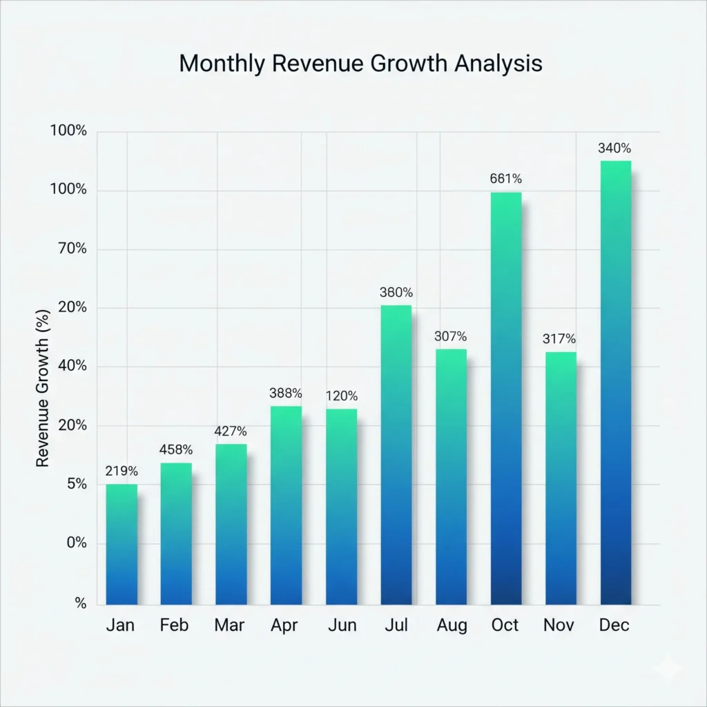
4. Column Chart
- Purpose: Vertical version of bar chart, great for time-based data. You can also customize the color as well
- Example: Monthly revenue growth. Column charts are perfect for finance charts in Zoho Analytics to highlight cash inflows over months.
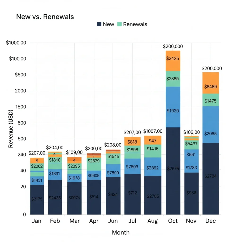
5. Stacked Column Chart
- Purpose: Show breakdowns over time.
- Example: Subscription business revenue split into “new” vs. “renewals.” Ideal for SaaS analytics dashboards.
Learn More : Combine Multiple Sources Before Charting
Part 2: Trend Charts in Zoho Analytics
Trends show whether performance is improving, stable, or declining.
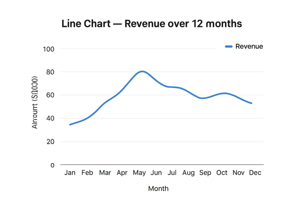
6. Line Chart
- Purpose: Show changes over time.
- Example: Revenue over 12 months. Perfect for finance dashboards or sales reports.
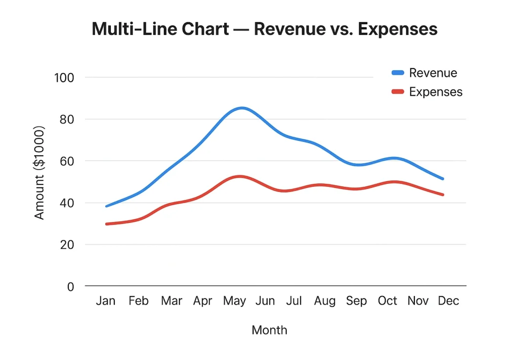
7. Multi-Line Chart
- Purpose: Compare multiple trends.
- Example: Plot revenue vs. expenses to track profitability. These Zoho Analytics chart examples make finance insights clearer.
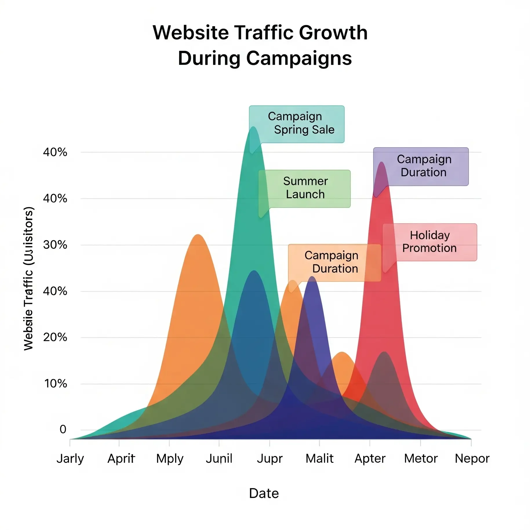
8. Area Chart
- Purpose: Emphasize volume under a trend line.
- Example: Website traffic growth during campaigns. Great for marketing dashboards in Zoho Analytics.
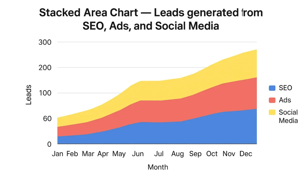
9. Stacked Area Chart
- Purpose: Show contributions over time.
- Example: Leads generated from SEO, Ads, and Social Media. You see both the total trend and contribution by source.
Read More: 12 AI Feature in Zoho Analytics
Part 3: Relationship Charts in Zoho Analytics
Understanding relationships helps answer “why” questions.
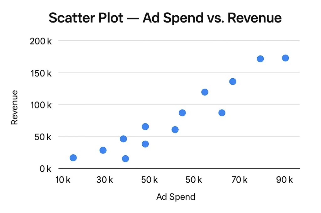
10. Scatter Plot
- Purpose: Show correlation between two variables.
- Example: Ad spend vs. revenue. Zoho Analytics graphs explained correlations clearly with scatter plots.
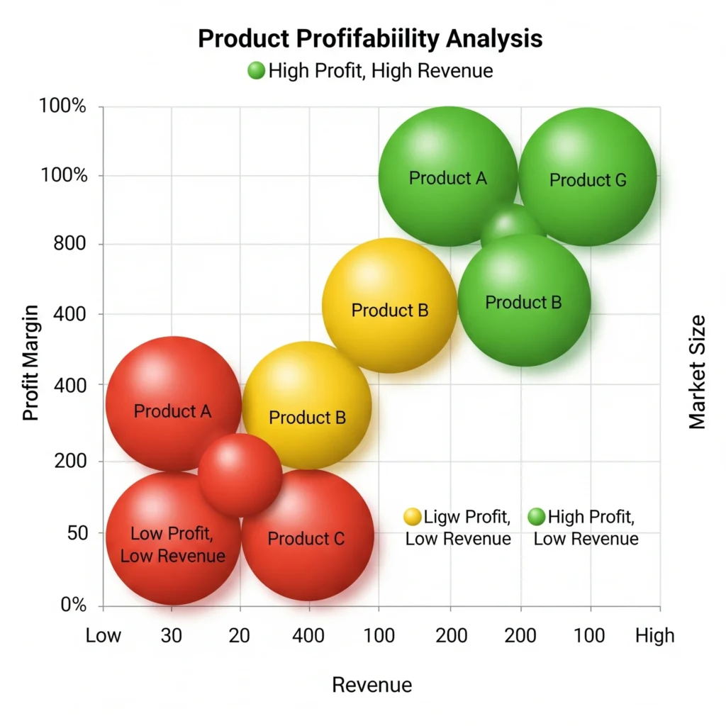
11. Bubble Chart
- Purpose: Add a third dimension (size).
- Example: Product profitability analysis (X = revenue, Y = profit margin, bubble = market size).
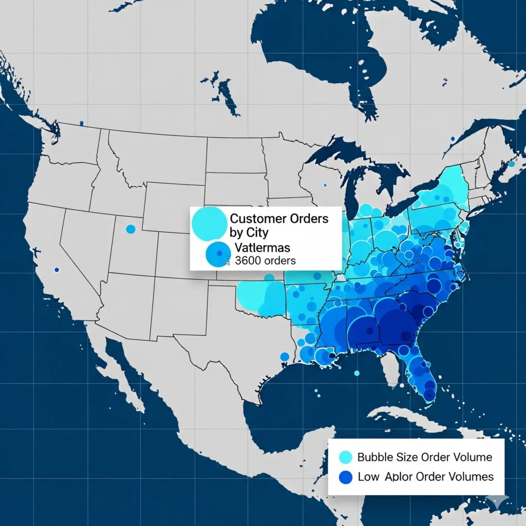
12. Bubble Map (Geo)
- Purpose: Combine geography with size representation.
- Example: Customer orders by city, with bubble size showing order volume.
Part 4: Proportion Charts in Zoho Analytics
These charts explain what percentage each part contributes to the whole.
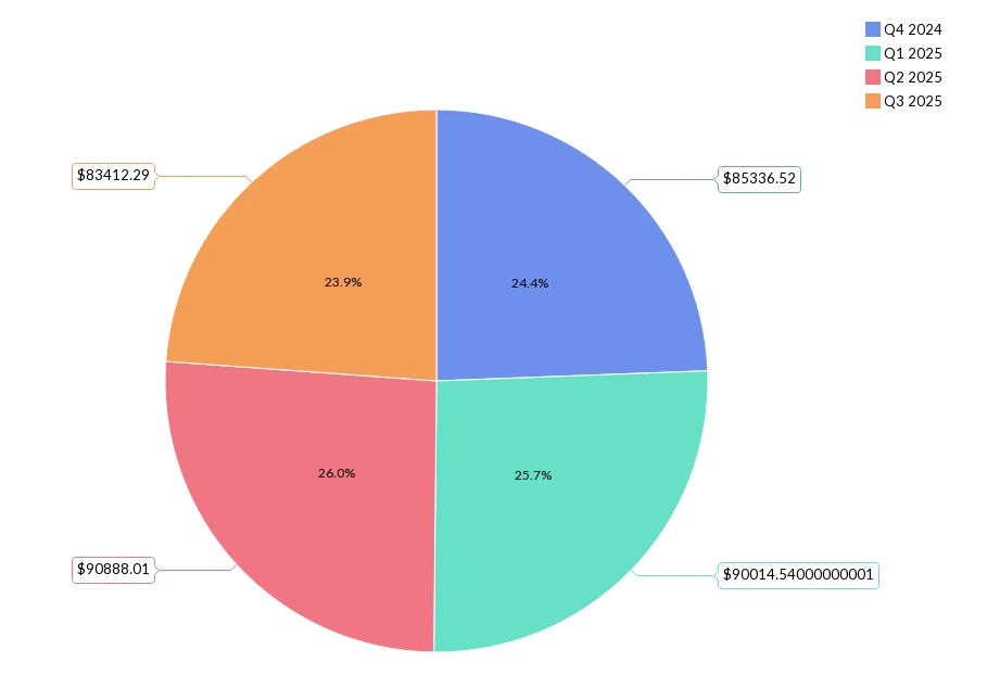
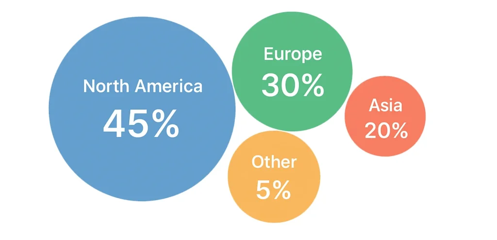
13. Pie Chart
- Best Use: Small data categories.
- Example: Sales in last 4 quarters. You can drill down to the month, week and date from quarter by clicking on the corresponding points.
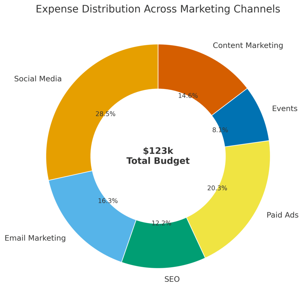
14. Donut Chart
- Advantage: More elegant than pie, allows total in the center.
- Example: Expense distribution across marketing channels with total budget in middle.
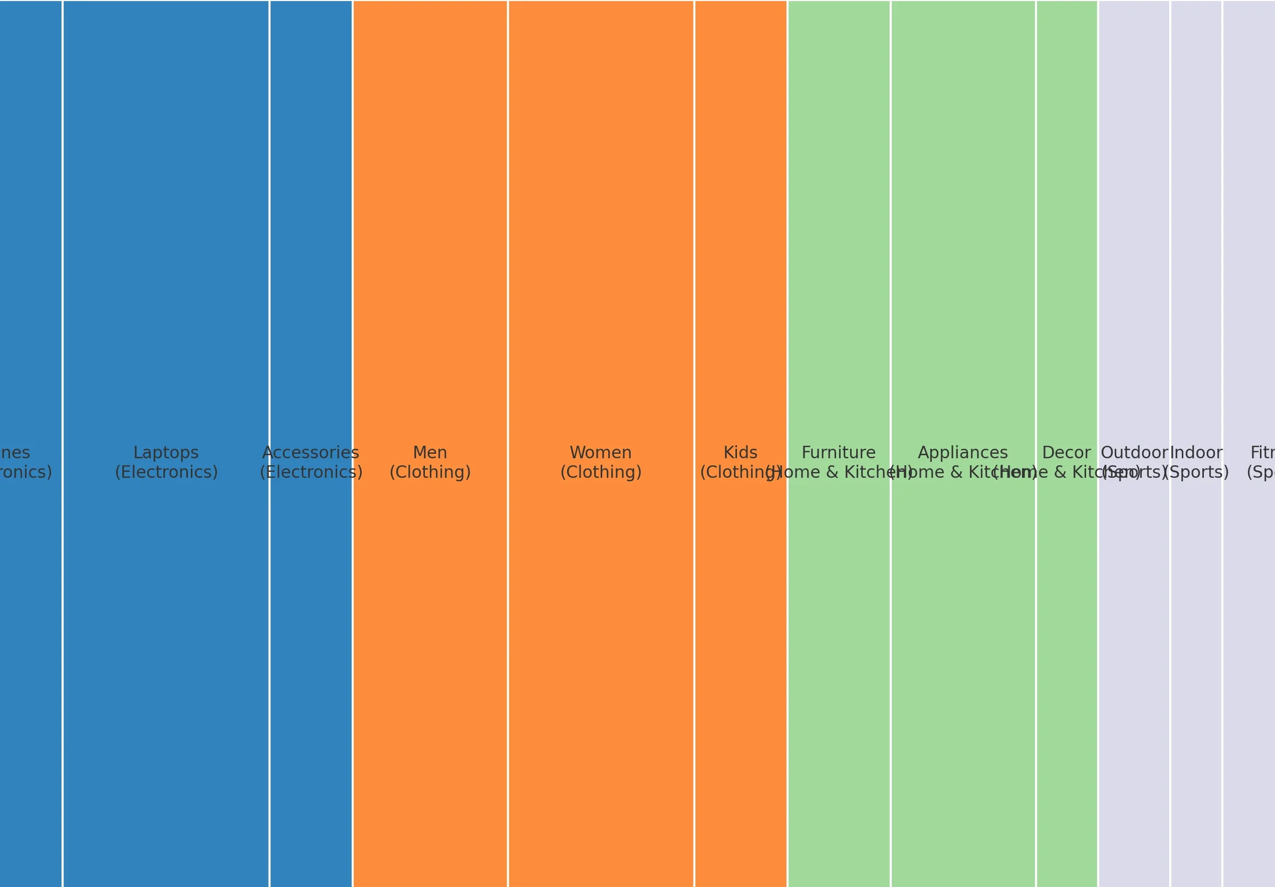
15. Tree Map
- Purpose: Show large hierarchical data.
- Example: Sales by product line and sub-category.
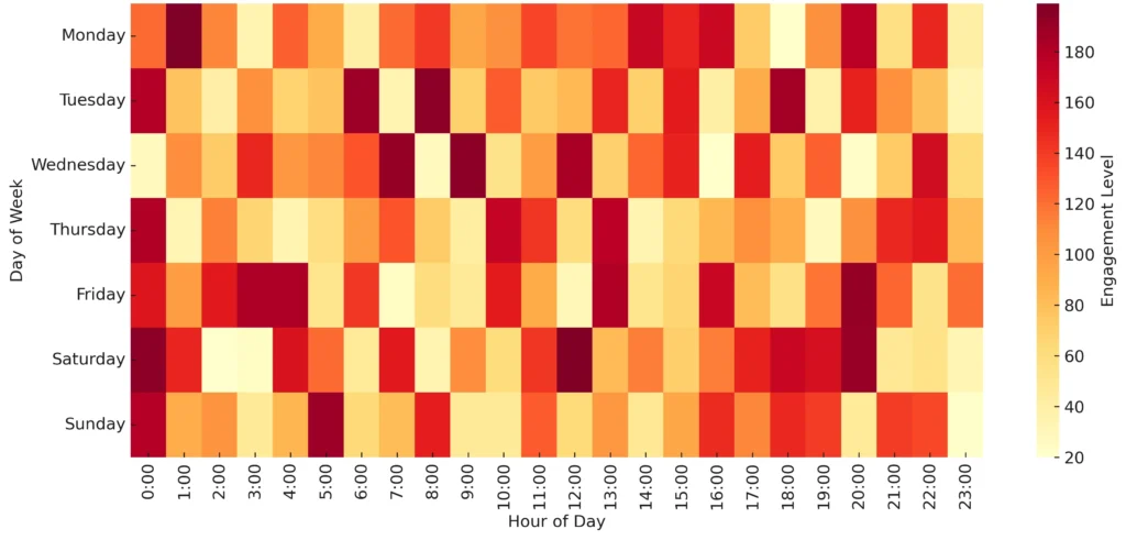
16. Heat Map
- Purpose: Highlight intensity with color.
- Example: Website engagement by day and time. A must for marketing dashboards in Zoho Analytics.
Part 5: Process & Performance Charts
Some charts are designed to track progress, performance, or workflow funnels.
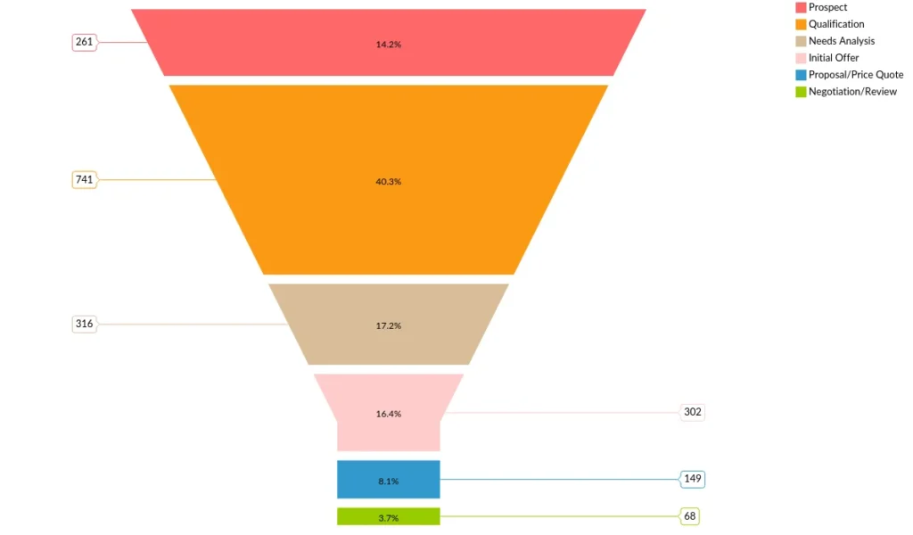
17. Funnel Chart
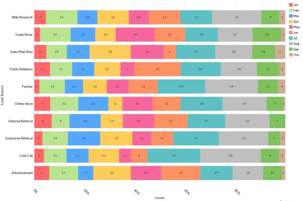
- Use Case: leads Pipeline By Count and Stage
- Example: Counts of Open Opportunity leads → qualified leads → closed deals. Perfect for sales reports in Zoho Analytics.
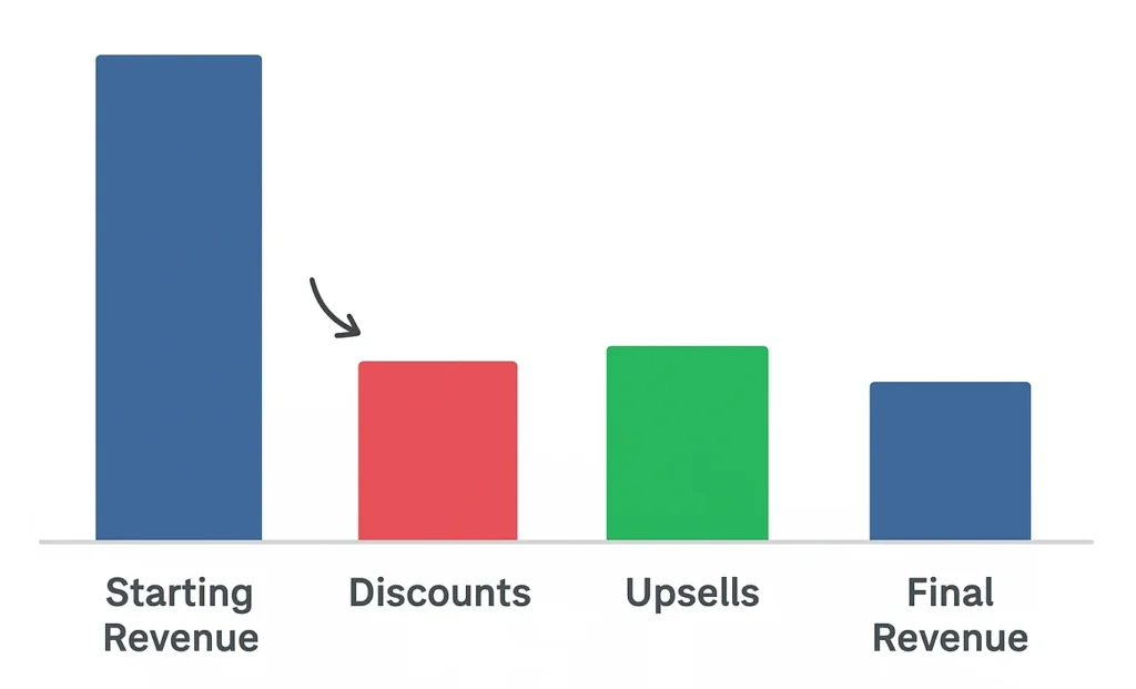
18. Waterfall Chart
- Purpose: Show incremental impact of factors.
- Example: Starting revenue → discounts → upsells → final revenue.
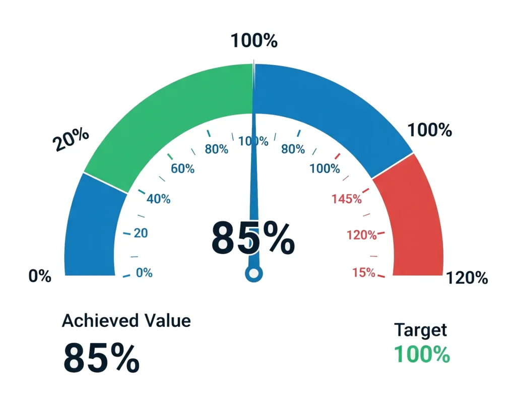
19. Gauge Chart
- Purpose: Show progress toward a goal.
- Example: Achieved vs. target sales quota. Works well in Zoho Analytics KPI charts.
20. Horizontal Stacked Chart
- Purpose: Show horizontal wise count or percentage.
- Example: Leads created by source vs month of particular year
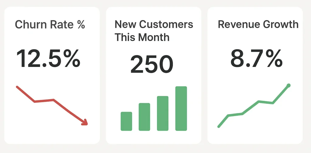
21. KPI Widgets
- Purpose: Focus attention on single key numbers.
- Example: Churn rate %, new customers this month, revenue growth. These HR analytics charts Zoho Analytics widgets could also track employee attrition.
Learn More : Control Chart Visibility
Part 6: Advanced & Combo Charts
When you need deeper storytelling.
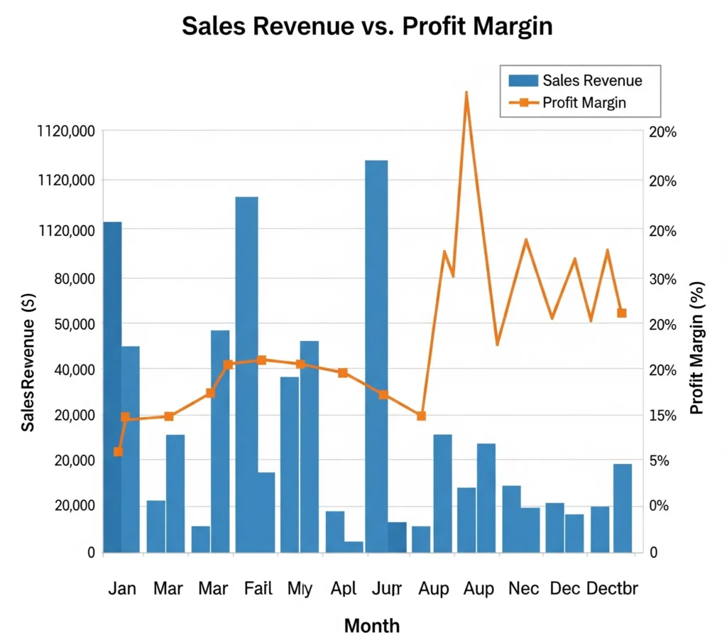
22. Combo Chart (Bar + Line)
- Purpose: Compare two measures in one chart.
- Example: Sales revenue (bars) vs. profit margin (line).
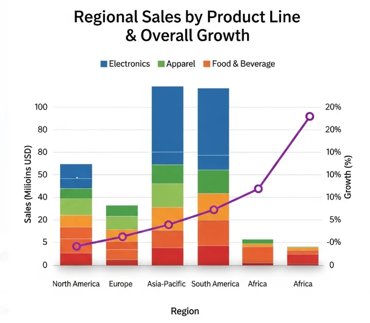
23. Stack Combo Chart
- Purpose: Add layers to combo visualization.
- Example: Regional sales by product line stacked with overall growth as a line.
24. Packed Bubble Chart
- Purpose: Compare many categories by size.
- Example: Customer base by geography.
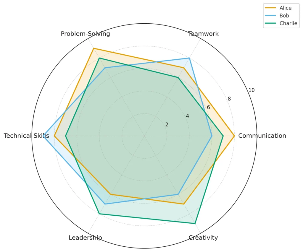
25. Radar Chart
- Purpose: Compare performance across dimensions.
- Example: Radar Chart comparing multiple employees competencies evaluation. A perfect fit for HR analytics charts Zoho Analytics.
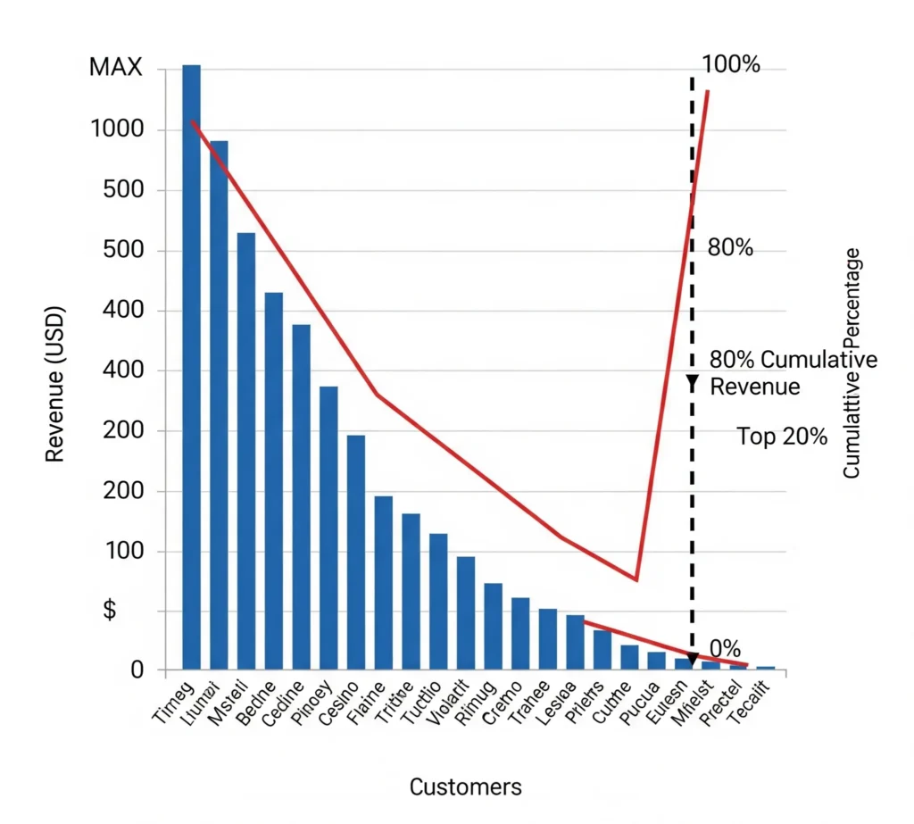
26. Pareto Chart
- Purpose: Apply 80/20 rule.
- Example: Identify top 20% of customers driving 80% of revenue.
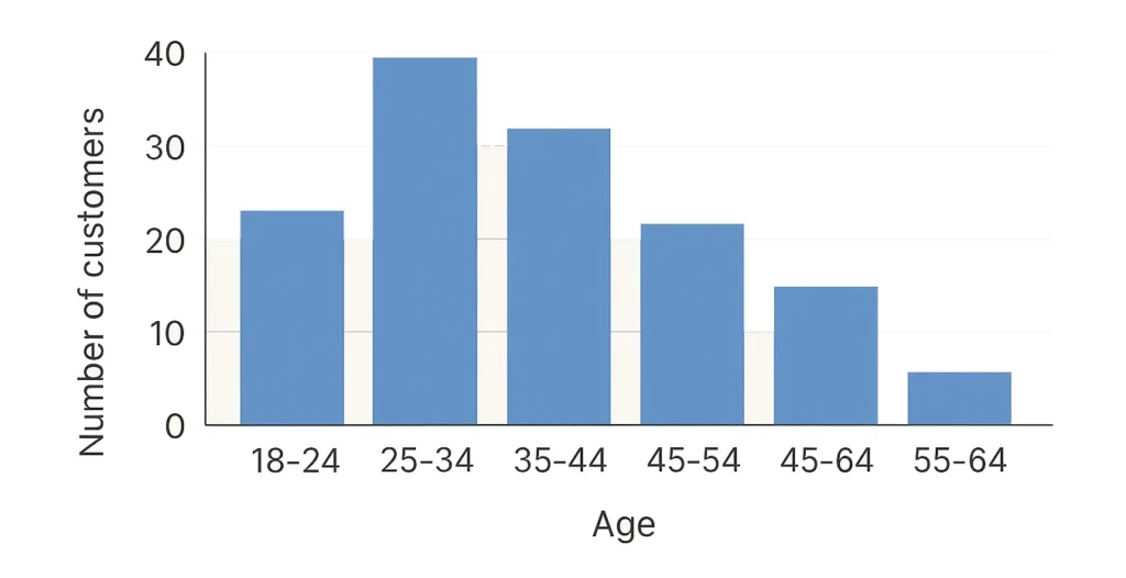
27. Histogram
- Purpose: Show frequency distribution.
- Example: Customer age distribution.
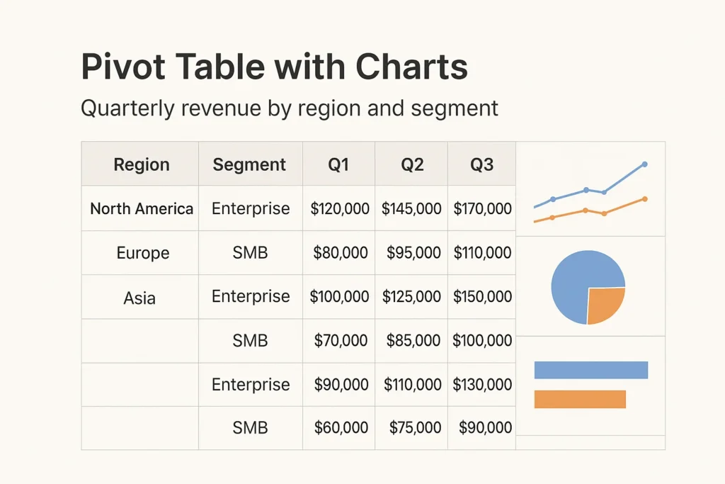
28. Pivot Table with Charts
- Purpose: Summarize complex data.
- Example: Quarterly revenue by region and segment with visual charts attached.
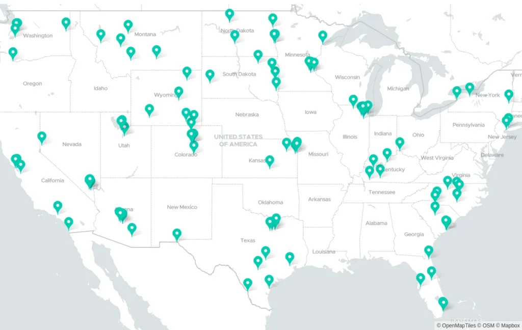
29. Geo Map (Region Map)
- Purpose: Show intensity by geography.
- Example: Sales by state shaded by revenue.
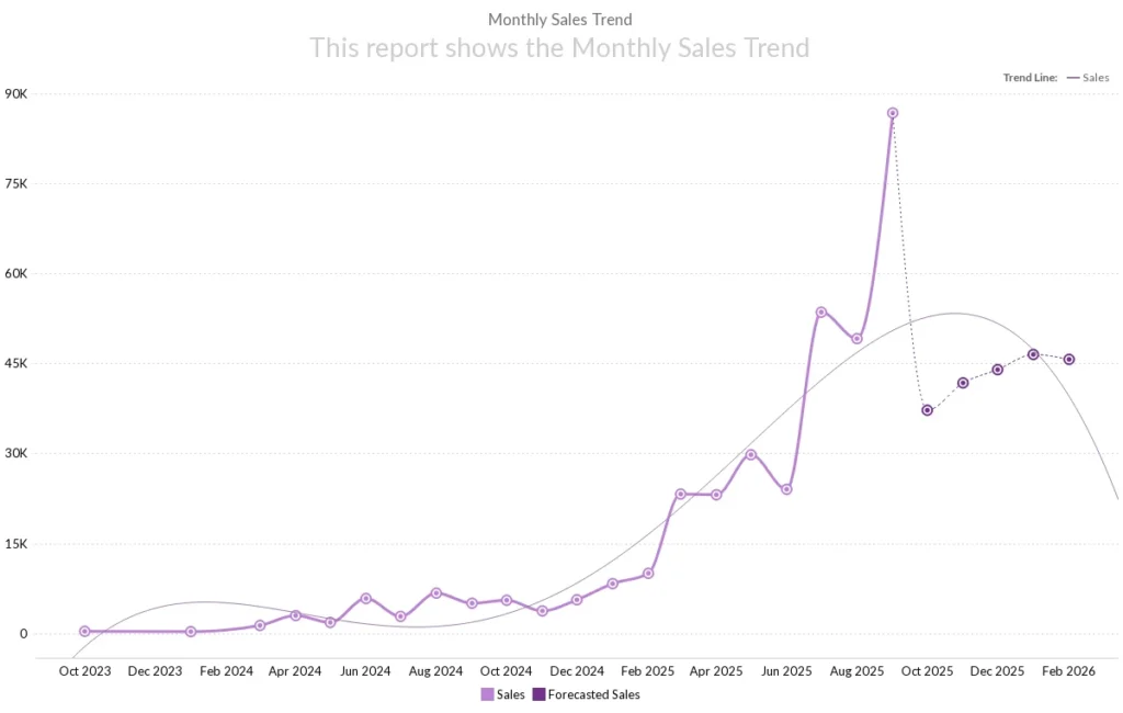
30. Trending/Forecasting Charts
- Purpose: Show change dynamically prediction based on previous trends.
- Example: Sales Highest and Lowest Month-Over-Month Growth in and it will be used more to identify the trends up side or down side based historical data.
Part 7: Zoho Analytics Best Practices
Designing a dashboard isn’t just about knowing the types of graphs in Zoho Analytics. It’s also about presentation and clarity. Here are some Zoho Analytics dashboard design tips and Zoho Analytics best visualization practices:
- Clarity over beauty: A simple bar chart often tells a better story than a complex 3D chart.
- Use consistent colors: Assign one color for revenue, another for costs, etc. This avoids confusion.
- Limit pie slices: Don’t use a pie chart with 15 slices—use a tree map instead.
- Highlight KPIs: Always add Zoho Analytics KPI charts for top 3–5 metrics.
- Tailor dashboards by department:
- Sales teams: Best charts for sales reports in Zoho Analytics → bar, funnel, combo.
- Finance teams: Finance charts in Zoho Analytics → line, column, waterfall.
- Marketing teams: Marketing dashboards in Zoho Analytics → heat maps, stacked area, funnels.
- HR teams: HR analytics charts Zoho Analytics → radar, KPI widgets, attrition trends.
- Tell a story: Each chart should answer a question—don’t just “fill space.”
Conclusion: From Data to Decisions
Zoho Analytics is more than a BI tool—it’s a storytelling engine. The right visualization turns data into decisions.
- Use bar, column, and line charts for comparisons and trends.
- Use pie, donut, tree maps, and heat maps for proportions.
- Use scatter, bubble, and radar charts for relationships.
- Use funnel, gauge, KPI widgets, and horizontal stacked charts for performance.
This Zoho Analytics chart tutorial gave you a step-by-step guide to understanding all types of charts in Zoho Analytics. Whether you’re building finance charts in Zoho Analytics, marketing dashboards, or HR analytics charts Zoho Analytics, you now have the right toolkit.
With these Zoho Analytics dashboard design tips and best visualization practices, your dashboards will no longer just look good—they’ll drive measurable impact.
So the next time someone asks you about types of graphs in Zoho Analytics or needs a Zoho Analytics visualization guide, you’ll know exactly which chart to recommend.
👉 Start building your next dashboard today, and watch how Zoho Analytics turns complex data into crystal-clear insights.
Frequently Asked Questions (FAQ) – Zoho Analytics Charts
Zoho Analytics offers 30+ chart types, including bar, line, area, pie, funnel, scatter, geo maps, and KPI widgets. Each chart serves a unique purpose like comparison, trends, or proportions.
Bar charts, funnel charts, combo charts, and KPI widgets are the best for sales reports since they clearly highlight revenue trends, conversions, and performance goals.
Finance teams benefit from waterfall charts, line charts, pivot tables, and bullet charts because they explain profit/loss, cash flow, and cost breakdowns effectively.
Yes. Marketing dashboards often use funnel charts, stacked bar charts, pie charts, and geo maps to track campaigns, lead sources, and regional performance.
HR analytics dashboards use pie charts (employee distribution), bar charts (hiring trends), heat maps (attrition rates), and KPI charts (headcount vs. retention).
KPI charts track key business metrics such as revenue growth, customer churn, and performance targets. They’re often used in executive dashboards.
Charts represent data visually in multiple forms (bar, line, funnel), while graphs (scatter, line) focus on showing mathematical relationships between data points.
Yes. Combo charts let you combine bars and lines in the same visualization, useful for comparing actual vs. target performance or revenue vs. expenses.
Start with your goal:
Performance → KPI/Funnel
Comparison → Bar/Column
Trends → Line/Area
Proportions → Pie/Donut/Tree Map
Relationships → Scatter/Bubble
Use minimal colors, keep labels clear, avoid chart clutter, and match chart types to your business question. Simplicity improves decision-making.
Zoho provides a chart tutorial inside the platform. Start by importing your dataset, selecting “Charts,” choosing the right chart type, and customizing it.
Advanced options include radar charts, Pareto charts, heat maps, animated charts, and pivot tables with embedded visualizations.
Yes. You can sync data frequently (every 15 minutes with some connectors) and display real-time KPIs using live dashboards.
Using too many chart types, overloading dashboards with data, poor color usage, and not aligning charts with business goals.
Stacked bar charts show cumulative totals, while grouped bar charts compare individual categories side by side.
Line charts, area charts, and stacked area charts are the best for identifying long-term performance trends.
Yes. Zoho Analytics allows trend lines, regression, and predictive modeling that can be applied to line or area charts.
Keep dashboards goal-focused, group related charts together, use filters for interactivity, and always include KPI widgets for high-level summaries.
Yes. You can publish dashboards with embedded code or via secure links for clients, teams, or public use.
Zoho Analytics offers automation, interactive dashboards, advanced charting, real-time collaboration, and AI insights — far beyond static Excel charts.
Use a pie chart if you want to show a quick snapshot of proportions. Go for a donut chart if you want to highlight multiple proportions while keeping a central focus point (like “Total Revenue” in the center).
Yes! Heat maps are great when you want to instantly see which categories perform well (high intensity) and which underperform. For example, product categories with poor sales will literally “cool down” on the chart.
Absolutely. Stacked bar charts, funnel charts, and geo maps are excellent for showing leads by source, campaign ROI, and regional reach in marketing dashboards.
There’s no strict limit, but best practices suggest keeping 6–8 charts per dashboard. More than that, and users may feel overwhelmed.
Funnel charts are perfect for tracking conversion stages like leads → qualified leads → opportunities → deals closed. Sales and marketing teams rely heavily on these.
Yes. With drill-downs, you can click a chart element (like a sales region) and instantly break it down into subcategories (like states, cities, or individual reps).
Yes. Line charts, stacked column charts, and combo charts are commonly used to compare YoY growth, seasonal patterns, and revenue performance.
Zoho Analytics can blend data from different sources (CRM, finance, marketing) and present them in a single chart or dashboard. For instance, you can combine sales CRM data with Google Ads leads into one visualization.
Animated charts aren’t just for looks — they’re helpful in storytelling presentations where you want to show data changes over time dynamically.
Yes! Zoho’s Zia AI assistant can suggest chart types based on your dataset. It analyzes your fields and goals, then recommends the most relevant visualization.


Very excellent information. I have seen most of 8 to 10 charts. But this is really nice information i learnt lot. Thanks
Thank you I have really learned a lot, I know of 7 charts
Thank you for your interest. I written more zoho knowledgeable post. have a look into more you will get some more insightful information.
Excellent overview of chart selection. The emphasis on matching visuals to the analytical question is especially useful for consistent reporting.
Thank you! Glad you found the focus on aligning visuals with the right questions helpful.
Thank you very informative.Excellent and smart overview of chart selection